We all want to create an app people love to use, and it’s really heartbreaking when you build something and no one cares about it.
The biggest challenge is not building your app and getting new users. The challenge is to keep them engaged and coming back. This is why we should start with user engagement and retention.
It doesn’t make sense to pour water into a leaking bucket, right?
We know super successful games, such as Angry Birds or Candy Crush, that people barely can put down.
But if you’re not in the game business, how can you make your app more engaging?
In this post, we created a guide that will help you create an app (no matter if it’s mobile or web app) that’s engaging and keeps people coming back.
We follow Nir Eyal’s hook model, stuffed with actionable tips you can use right away.
Check out this interactive content below or just simply scroll down a bit and keep reading.
Created using Visme. An easy-to-use Infographic Maker.
Step 0: Painkiller or vitamin?
When we’re sick, we crave a solution that eases the pain. We’re looking for a painkiller.
But the situation is absolutely different when it comes to vitamins. Vitamins are nice to have to keep your body balanced, but they are not really something people crave.
Painkillers are must-haves; vitamins are nice-to-haves.
The question is whether your app is a painkiller or a vitamin. And this makes all the difference.
As a member of a failed startup and after having seen many fail, trust me—I know what I’m talking about.
Your app needs to be useful and provide value to your target audience, so they can’t live without it.
You can have the best retention strategy, but without a great app that solves real problems, it’s worth nothing. The sad truth is that only 9% of users will stay on an app if it doesn’t satisfy their needs.
Ouch.
Here is how to get closer to what users are actually looking for:
If your app is just an idea, conduct customer development interviews with the target audience. Make sure to ask the right questions (to avoid leading their answers). You need to figure out the biggest challenges your users face and learn more if they’re actively searching for solutions. To make your questionnaire bulletproof, follow the mom test.
If your app is already out, you need to figure out how valuable your current users find your app. Here is how to do it:
Product/market fit survey (if 40% of people say very disappointed, you have a product-market fit.
Net promoter score (How likely would you recommend <your product> to your friend?). People should pick a number from a 1 to 10 scale, where 10 is the strongest positive recommendation.
Increase App Engagement with Onboarding
Onboarding is about retention, not acquisition. ConversionXL
A good first impression starts with onboarding. Onboarding is the process when your app is introduced to the new users and it also determines the later engagement of your app. With onboarding you can have 3 goals:
- Explain how your product works.
- Motivate your users to get started.
- Let your users know how to get help, if and when they need it.
But before you jump right into designing your onboarding process, make sure to consider the following questions provided by ConversionXL:
- What’s the core value you’re trying to deliver to your users?
- What steps do new users need to take to receive that core value?
- What friction might exist within those steps?
- What actions do long-lasting users take? How can you encourage new users to take them?
- How familiar are your new users with similar products?
- How easy is it to understand your core benefits/functions?
Onboarding Best Practices
Once the core benefits are well defined, you need to make sure to introduce them in the simplest way possible. The need and complexity of onboarding depends on the complexity of your app.
But the thing is there is no perfect onboarding process. One that worked for one app probably won’t work for you. Yikes.
So what can we do?
Here are some general rules and practices you should keep in mind when designing your onboarding process:
- Too many signup fields: If you can’t come up with a good reason for asking that information, then don’t ask it during the signup. Ask only the most necessary information.
- Simplify login/signup: If users are required to sign up/login in your app, social or Google login is a great way to simplify this process.
- Keep onboarding short: The more complicated it is the higher the abandonment rate is.
- Show benefits instead of features. Stop explaining your features in details; show them the benefits. This is how you keep users engaged and interested.
- Confusing features/functions: Apps with complex features and less intuitive designs typically require onboarding. But there are apps that require really short or no onboarding at all.
- Tutorials: Providing customers with short tutorials on product benefits can reduce churn by 6%. A great tutorial is:
- Short
- Can be accessed anytime (has an easy to reference location)
- Drops the users where they can take an action (updating status, uploading photo, creating a profile, adding friends).
Recommended resources:
User onboarding tools:
Answering the questions and keeping in mind the best practices mentioned above can gradually improve your onboarding process and avoid losing a ton of new users. But you still have to work on keeping these users around.
This is where Nir’s framework comes in the picture.
Framework to increase app engagement
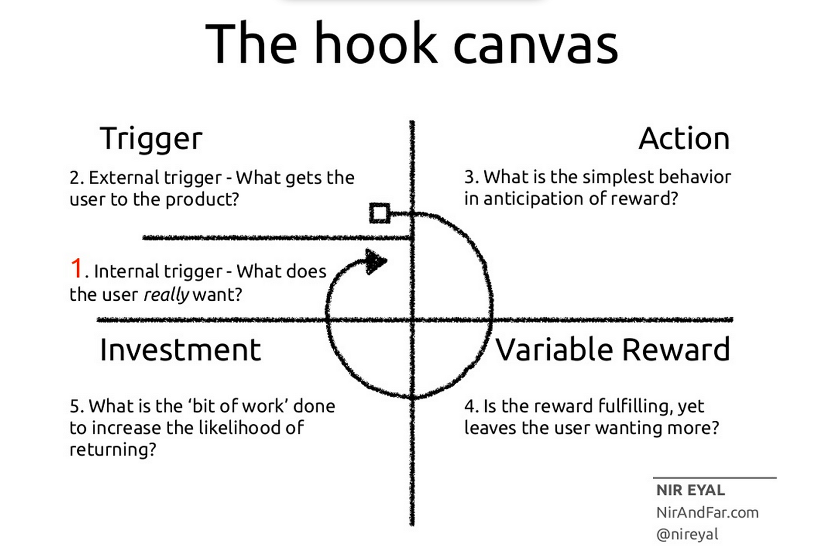
In his book Hook, Nir Eyal came up with a framework that helps create habit-forming products.
This part of the post is based on Nir’s findings, stuffed with examples and actionable tips. The model is made up of 4 steps. Nailing this process means you have a sticky app that keeps users coming back for more.
Trigger
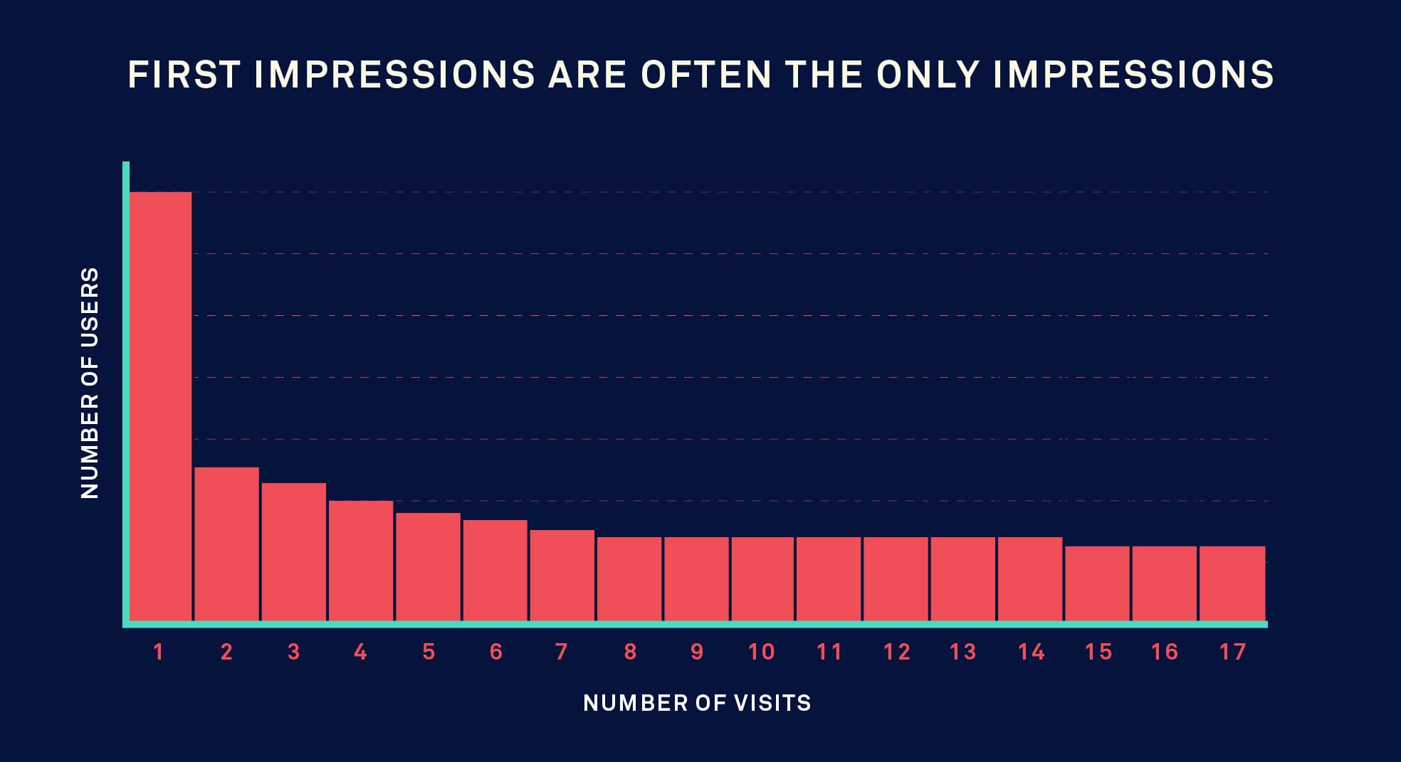
First impression is often the last impression as this image shows below.

Source: Intercomassets.com
A fair proportion of users abandon applications after the first visit and never come back. 67% of customer churn could be avoided if the business resolved the customer’s issue during their first interaction.
In fact, acquiring a new customer is anywhere from5 to 25 times more expensive than retaining an existing one.
That’s a lot.
Engagement and retention are more important than acquisition; once a user is on board you need to do everything to keep them. Both metrics determine how sticky your app is: how often users come back and what they do in the app.
- Engagement: How active users are in the application. Example: time spent in the app, number of actions taken, number of friends invited etc.
- Retention: Percentage of users who return to your app within a certain period of time.
That’s why it’s so important to build some triggers into your app that keep users coming back for more and staying longer.
A trigger is when something entices your users to get back and take an action in your app. These triggers can be:
- Internal: Users seek for it (thoughts, places, memories, people, emotions, routines). Also, negative emotions are really powerful triggers. What is your user’s internal trigger?
- External: Notifications coming from an external source. This could be push notification, email.
The question is what triggers can you apply? (In the following sections, we focus on external triggers).
External triggers
For increasing retention:
- Push notifications: Push notifications are pretty efficient to keep people coming back to your app. Not convinced? Here are some cool stats:
- Improve user retention to 56% according to Localytics
- 65% of users come back to the application within 30 days if push notifications are enabled.
- Users who enable notifications have a nearly 3x higher retention rate compared to those who disabled them.
- Email: Email is still one of the most efficient ways to reach users. You are 6x more likely to get a click-through from an email campaign than from a tweet. A message is 5x more likely to be seen in email than via Facebook.
- Retargeting: You can also retarget visitors on Facebook who downloaded your app but haven’t been active for a certain period. However, it costs money.
For increasing engagement:
- In-app messaging: Users receive them while they’re using your app. In-app messages could improve engagement by about 26%, and in highly used apps, they increase the engagement by about 44%.
- Gamification: If applicable, you could add game mechanics into your app to motivate participation, engagement, and loyalty. If users take a certain action, they receive a reward or achievement.
- Customer service/knowledge base: Good customer service helps them to overcome obstacles and solve questions in no time and also increases the lifetime value of your users. Also, creating FAQ pages and useful guides are great ways to decrease churn rate.
There are three important things that should be kept in mind:
- Frequency: The frequency of notifications depend on the nature of your app. Make push notification preferences customizable, allowing users to tailor notifications to their needs.
- Timing: Time of the day when the user is active. It’s worth A/B test testing different times to figure out what works the best.
- Relevancy: No spamming, since your users will get distracted and eventually ignore or turn off push notifications. Make sure that the notification is relevant. In every push notification you have to provide a compelling reason for the users to return. More on this in the reward section.
Action
After a successful trigger, the user needs to take an action. This is the minimum interaction to get reward. The most crucial thing here is to make the action as quick and effortless as you possibly can.
What is the minimum action the user can take in anticipation of a reward?
Here are some action examples:
- Google: searching for something and receiving answers, information
- Facebook: scrolling through your Facebook News Feed
- Uber: getting a ride on Uber with a tap of a button
Finding the minimum action takes time and many experiments. I recommend building analytics into your app to bring a data-driven approach when figuring out what works. Here are some tools:
Variable reward
The reward is the why and the objective for the user.
- How do you reward the user?
- Is there interesting variability?
These rewards can be grouped into three categories:
- Social rewards (tribe):
- Empathetic joy
- Partnership
- Competition
- Search for resources (hunt): hunting for clothes, prizes, information.
- Search for self-achievement (leveling up): improving, mastery and competency.
IMPORTANT: Build variable rewards to scratch the user’s itch, but leave them wanting more.
The way you incentivize your users depends on the nature of your app and it’s directly connected to your business model.
For example, if your app offers in-app purchases, you should focus on using special offers, discounts. For a free app, emphasize usage-based rewards (to keep them longer and show them more ads).
Investment
Once the user gets his reward, the next step is to get the user to invest, setting themselves up for the next trigger, storing value, and creating preference. This is where the user invests for future benefits/rewards mentioned above.
This investment can be money, time, effort, personal data, emotional commitment.
How do users load the next trigger, store value, and create preference by investing effort into your product?
- Investment loads the next trigger of the hook: For example you receive a new message on Messenger or a notification on Facebook (these are external triggers to get back to the app).
- Investment store value: Users get more content on your app, more followers, more friends or information.
Conclusion
Way before you start coding your app, the first thing you should make sure is that your app actually provides value to the target audience and figure out how to keep these users engaged for long. Since getting a new user is 5-25 times more expensive than re-engaged with an existing one this is where you should start the process. Pouring water into a leaking bucket doesn’t make any sense.


